

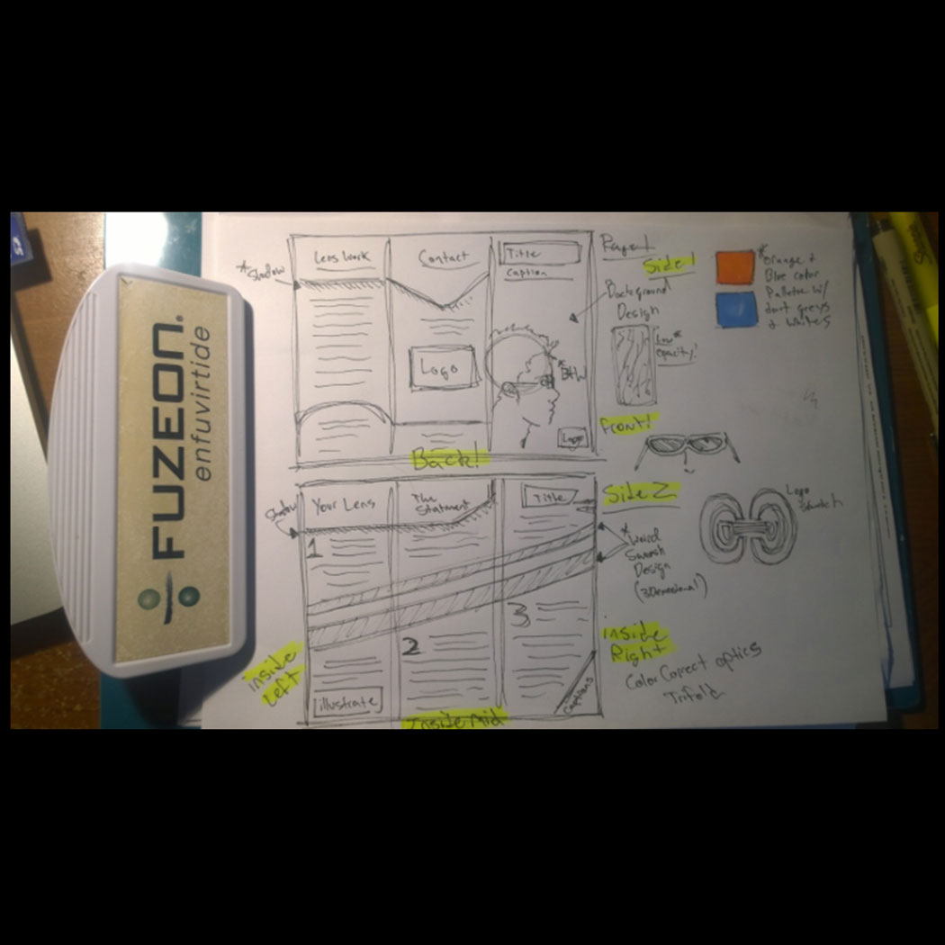
The assignment here was to create a tri-fold brochure to be distributed by a company called "Color Correct Optics". The corporation specialized in ophthalmology and eye wear. I started the design process with a rough (and I mean rough...just look at it) sketch of each side of the brochure.
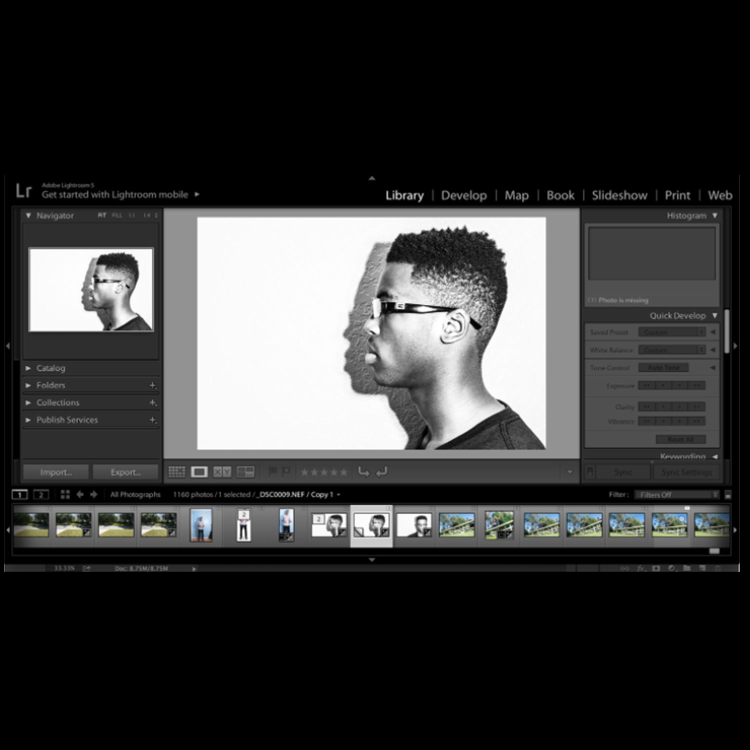
I figured displaying an actual pair of glasses on the cover might be a good idea. I chose to keep it in the family, and used my brothers profile to bring the vision to life. I photographed him myself and used a mid-high contrast range to make him stand out from the wall. This would make things easy for me later when trying to cut him out from the back wall.
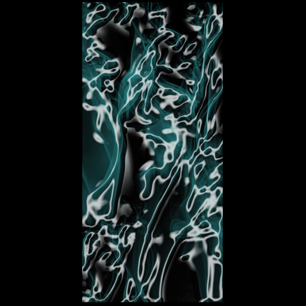
This image shows a cool pattern I came up with that would also be used in the cover of the brochure. I mentioned previously that my brothers profile needed to be removed from the background. The image here would eventually replace that background. So instead of seeing a boring wall from the original photo, this would be seen instead.
This is the front and back side of the brochure completed. The logo for the company uses blue, orange, and white as its color palette. I decided to keep that orange and blue "theme" running throughout the brochure. I wanted the whole brochure to feel modern and bold. Once the text was provided, the job was keeping the information clear, and making sure text didn't get too cluttered.
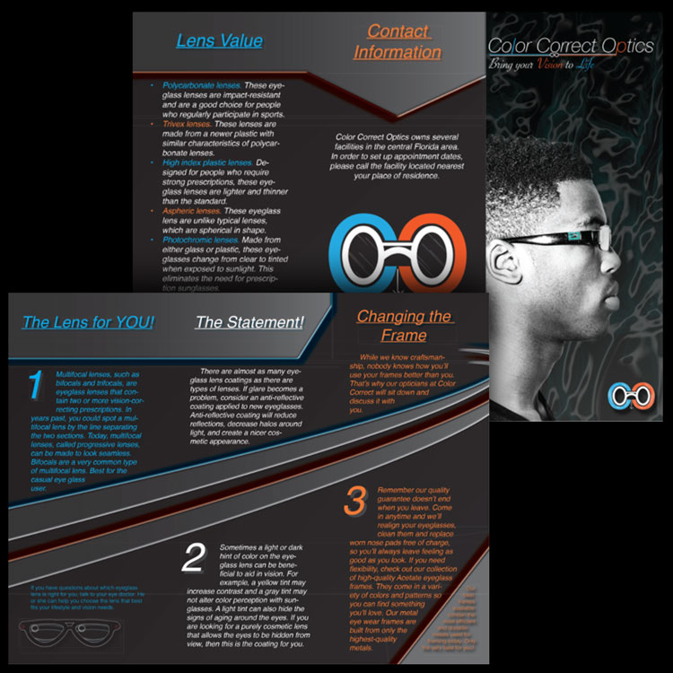
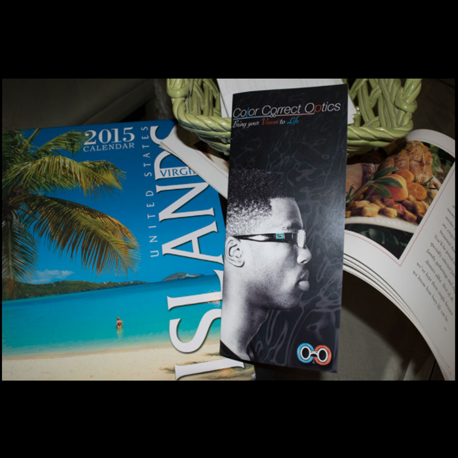
The brochure in its final print.
.png)